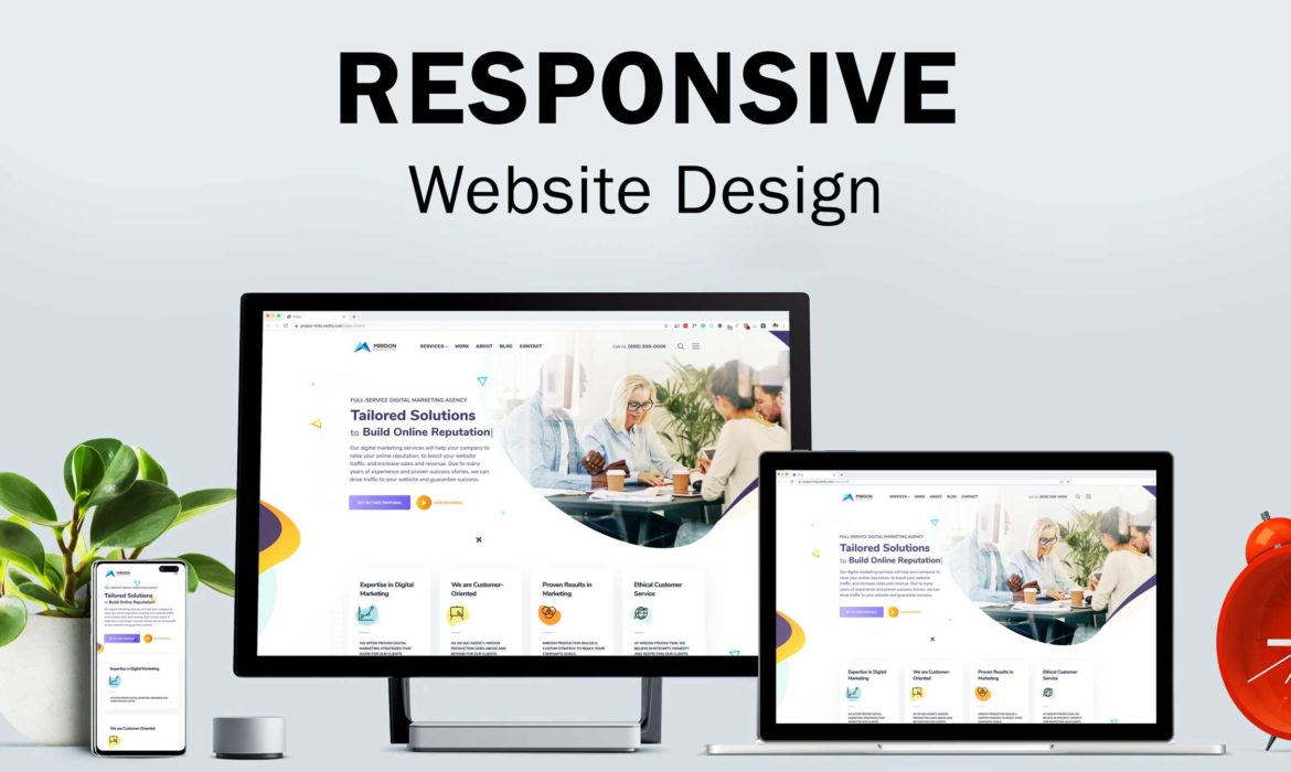
The website design is responsive when there is a seamless experience from desktop to mobile. A responsive website will alter its visual design and interactive components depending on the device and screen size used to view it. Responsive web design, a contemporary design approach that adjusts pages to the user’s screen size, is at the heart of these websites.
As long as you are using an intelligent visual web development platform, you are fine to go. Whether you’re undertaking a project for a responsive makeover or from scratch. These pointers will assist you in creating a website that functions flawlessly across various screen sizes and devices.
Tips For Designing Responsive Websites
You may ensure that your website is responsive and mobile-friendly by using the following suggestions for mobile website design and responsive design. Here are some of our top tips for creating responsive websites:
1. If you have to begin small, do so
Don’t try to make your whole website responsive in one go if you can’t. Take things slowly. Analyse the usage of your website to find out which pages are receiving which kinds of activity from which devices.
Then start optimising the pages with the biggest traffic and conversion potential. Start there, for instance, if you know that an advertisement is directing visitors to your sales page. Ensure the checkout design is fluid and responsive across various browsers and devices.
2. Embrace touchscreens
These days, touchscreens are standard equipment, even on laptops. Since both mouse and touchscreen users have different needs, responsive websites must be developed with both in mind. Consider designing a form with a drop-down menu in the desktop view.
It makes it bigger and simpler to tap with the fingertip on touchscreen devices. Additionally, remember that small items on smartphones are especially challenging to touch, so make an effort to incorporate graphics, calls to action, and buttons that appear correctly across all devices.
3. Change your focus from pixels and inches to grids
Adopting fluid grids produces flowing layouts that grow with the web pages instead of basing your website design on fixed-sized pixels. Instead of confining them to a single size as pixels would, the grid sizes the items on your website proportionally.
The adaptable grid can dynamically resize to meet the various screen sizes. The grid is constructed using proportions rather than pixels or percentages. Depending on the size of the screen used to show the layout, every element changes how wide they are about one another.
The web page is divided into columns in grid view, which makes it simpler to arrange the components on the page. Flexible grids perform 50% of the work in responsive design, but only if smaller displays cause the browser window to be too narrow. This won’t work because the plan spans two or three columns. In these circumstances, using media inquiries becomes essential.
4. Take Care When Navigating
Any website’s navigation is the most crucial component. It gives your visitors a map and makes navigating other pages on your website simple. The links to all the key pages in your navigation will typically be available on desktop versions of your site. The standard procedure when using a hamburger icon on mobile devices is to conceal the links behind it.
This isn’t always the greatest strategy, though, as some users could forget to click the icon to expose the menu and become angry when they can’t access other sites. A better strategy would be to use the hamburger menu for the remaining links and to keep the most crucial menu items accessible on smaller displays. To make it easier for users to navigate, you can also incorporate links to other sites in the content on your homepage.
5. Delegate your project
Consider contracting with a team with expertise in creating responsive websites that meet all the above requirements. If you want to shorten the time it takes to launch a bespoke responsive website.
Find an outsourcing partner who can offer guidance on every step of the process, from hosting and technology stack through design, development, and integration of microservices. Make sure to include only companies in your project with defined procedures and who don’t save testing until the end.
Conclusion
A responsive website recognizes the user’s device automatically, modifies the layout to match the device’s requirements, and improves the user experience. Regardless of the device being used, responsive web design seeks to offer a consistent user experience. For companies of all sizes, designing for mobile devices is more than necessary for success in today’s market.
